State of Speedrunning: A Power BI Report
Overview
In this project, I present a set of data visualizations that describe the current state of speedrunning, which is a form of competitive gaming where players attempt to complete a game or level as quickly as possible. These visualizations were created using Microsoft Power BI, and built atop data from ~1.5 million players retrieved using the API of speedrun.com (a website used by the vast majority of speedrunners to log their progress).
Power BI reports can be challenging to share outside of Microsoft Power Platform and the surrounding ecosystem, especially when they include large amounts of data. In the following sections, I provide images of each report page along with a description of its key conclusions and some of the DAX code used to create the visualizations. The GitHub repository for this project contains a PDF of the report and a Python file with the API request code. The complete .pbix file, including data, can be downloaded here (420 MB) and imported into Power BI Desktop in order to make the report interactive.
The Data Model
Before diving into the visualization within the report, we will first take a closer look at its underlying data model. There are fourteen tables within the model that have relationships between one another, and which hold all of the data1. Their model diagram is given below:
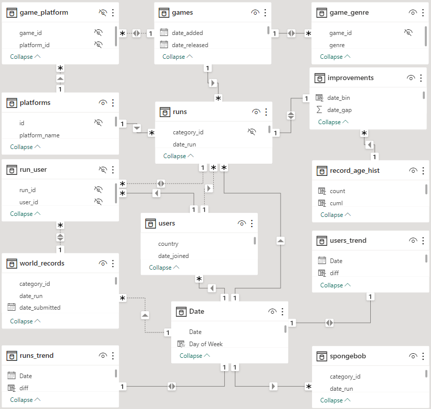
The most important tables are users and runs, which hold information about the individual players and speedruns respectively. Since it is possible for one user to have multiple speedruns and for one speedrun to be performed by multiple users, the two tables must be linked together using the bridge table run_user. The run_user table is also connected to world_records, which holds information about the subset of speedruns which were the fastest ever at the time of their submission. Another important table is games, which holds information about every game that has had at least one speedrun submitted. The platforms and game_genre tables provide further information about the game’s hardware and genre type.
The table with the most relationships is Date, which as its name suggests is a date table. Date tables contain information about individual dates within some period of interest, such as the year, month, day of the week, etc. While all of this information can be calculated on the fly, the date table guarantees that all dates are covered and allows for DAX filtering across various date/time attributes.
Runs Overview
The first page of the report provides summary statistics for all of the speedruns that have been submitted to the speedrun.com website:
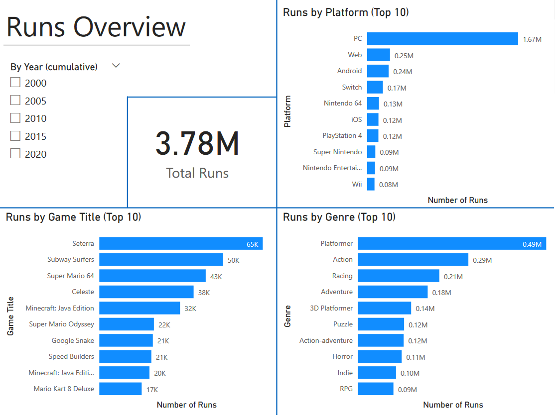
The upper-left quadrant contains a slicer that restricts the data to all runs that were submitted at or before the chosen year2. The quadrant also contains a “card” visualization that counts the total number of runs within the filter context, which is computed using the following DAX code:
cumulative_runs := IF(
    HASONEVALUE(year_slices[Year]),
    CALCULATE(
        [total_runs],
        FILTER(
            runs,
            YEAR(runs[date_run]) <= VALUES(year_slices[Year])
        ),
        NOT(ISBLANK(runs[date_run]))
    ),
    [total_runs]
)
The CALCULATE function computes the total_runs measure (which just counts the rows in the runs table) under a filter context whose condition is based on the state of the slicer. The slicer propagates the context onto the measure using the stand-alone year_slices table, which is filtered directly by the slicer and then queried using the VALUES function. If no year is chosen on the slicer, or multiple values are chosen, no additional filters are applied to the total_runs measure. The bar charts in the other three quadrants are also calculated using the cumulative_runs measure, just with different types of filtering (platform, game title, and genre) applied on top of the slicer’s context.
Users Overview
The second page of the report gives information about the speedrun.com userbase:
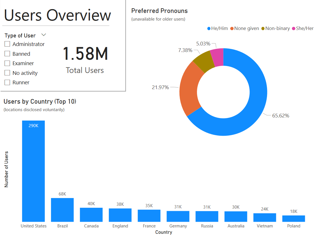
There is less information available about users than there is for speedruns, so this page focuses on their gender breakdown and home country. The slicer in the upper-left of the page divides the users into categories based on their role/activity on speedrun.com: administrators run the site, examiners determine the legitimacy of runs submitted to the site, runners have submitted at least one speedrun to the site, users with no activity have only created an account on the site, and banned players committed some transgression that got them kicked off of the site.
Across all categories, the United States is the most common home country for speedrunners. The rank of the other countries varies depending on the type of user, with countries such as Vietnam and India being especially overrepresented among banned players. Although information about gender is not directly gathered by speedrun.com, the site does provide a user’s preferred pronouns (if they have been declared). In the report, these pronouns are classified into gender categories using the following calculated column:
users[pronouns_simplified] = IF(
    EXACT("She/Her", users[pronouns]) || EXACT("He/Him", users[pronouns]) || ISBLANK(users[pronouns]),
    users[pronouns],
    IF(
        EXACT("", users[pronouns]),
        "None given",
        "Non-binary"
    )
)
While this transformation is imperfect, it can broadly capture trends in male/female representation among speedrunners.
Covid Impact
The third page of the report looks at trends in speedrunning activity over time, with particular interest paid to how the COVID-19 pandemic impacted participation:
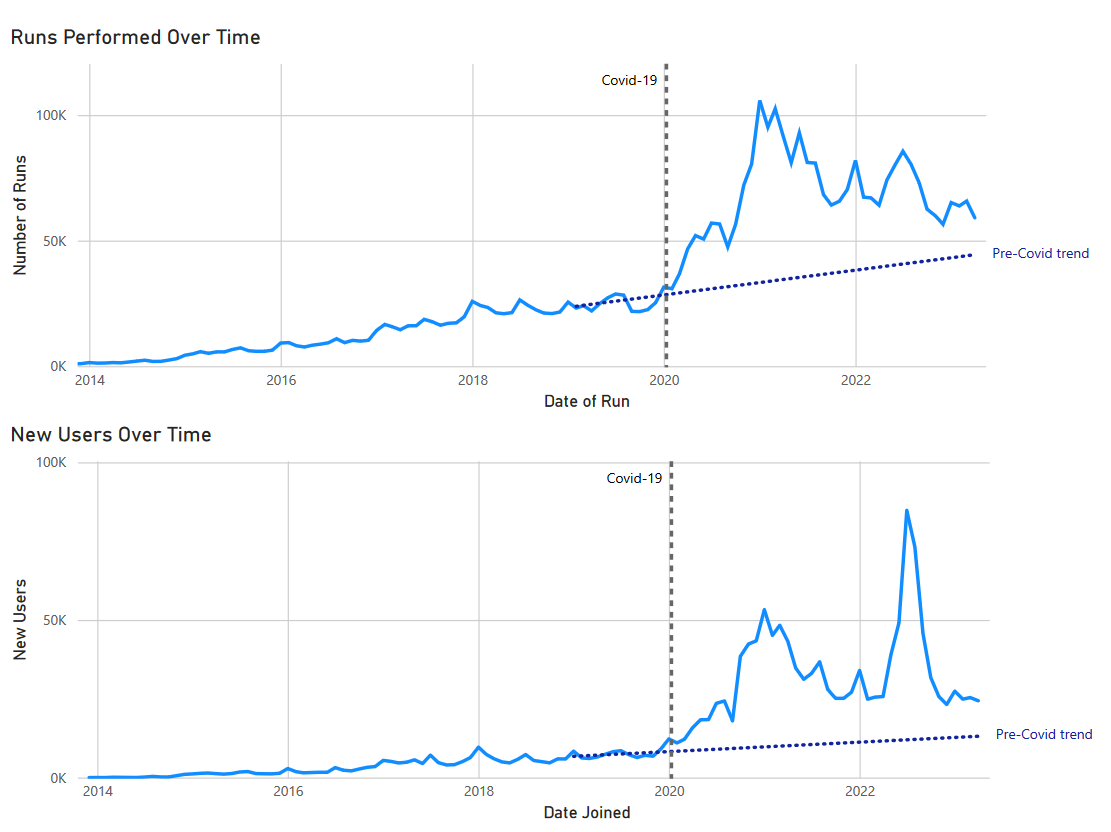
The most complicated aspect of these plots is the trend line, which needed to be fit to the data and then extrapolated forward in the plot. This was done using a sequence of DAX measures based off of regression coefficients contained in the stand-alone tables runs_trend_coeff and users_trend_coeff. The functions for computing the speedruns trend line are given below:
runs_trend[diff] = DATEDIFF(DATE(2015, 1, 1), runs_trend[Date], MONTH)

runs_trend[trend] =
    VALUES(runs_trend_coeff[Intercept]) + runs_trend[diff] * VALUES(runs_trend_coeff[Slope1])

runs_trend_val := CALCULATE(
    SUM(runs_trend[trend]),
    KEEPFILTERS(runs_trend[Date] > DATE(2019, 1, 1))
)
The diff calculated column computes the time difference between the starting date of the regression function (1/1/2015) and the sequence of dates from 1/1/2015 to 4/30/2023 (the date the data was retrieved from speedrun.com). Using the regression coefficients in runs_trend_coeff, the diff column is then further transformed into the trend column, which holds the value of the trend line at each date. The runs_trend_val measure at the end is simply used to control how much of the trend line should be displayed on the plot3, by combining the chosen end date filter with the existing context generated by the graph.
Distribution of Runs
The fourth page of the report describes how runs are distributed across games, platforms, and players:
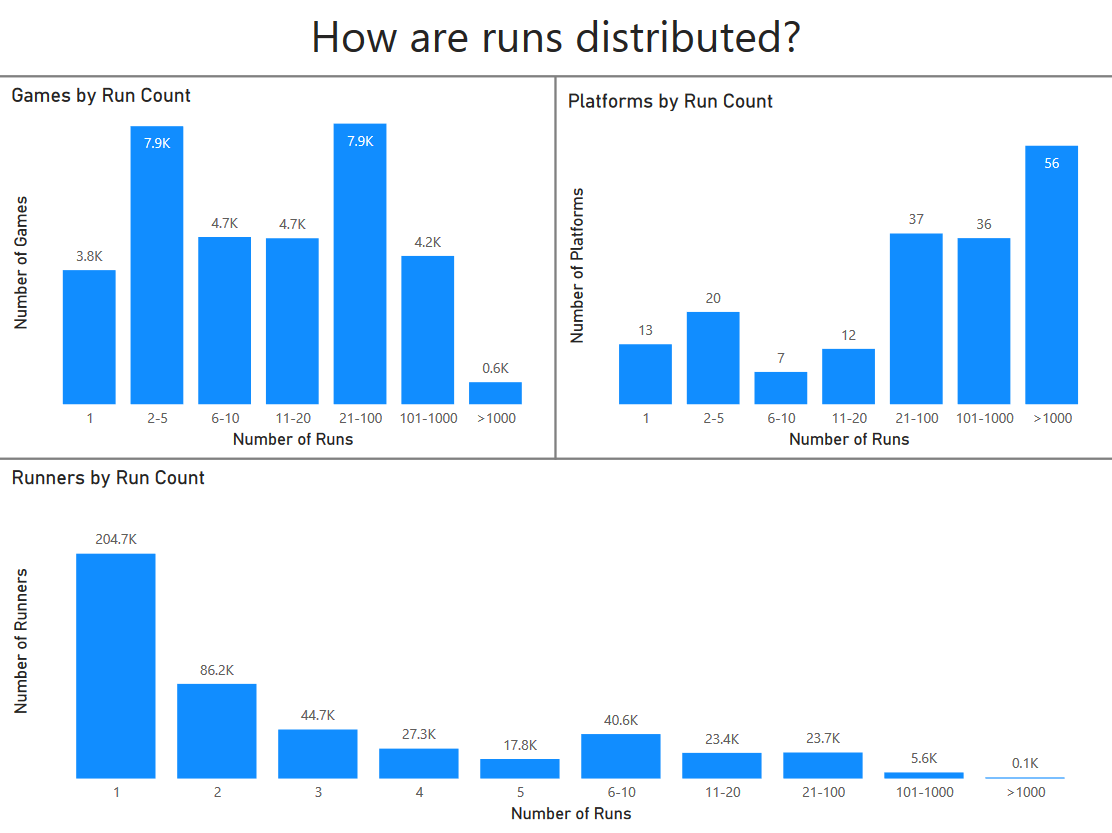
The histograms on this page show that the vast majority of players have submitted fewer than five speedruns, and that only a small fraction of games are able to attract more than a thousand speedruns. Creating histograms with customized bin widths and labels can be a bit awkward in Power BI, with the easiest method being the creation of stand-alone calculated tables. For example, the table user_run_hist used for the runners plot at the bottom of the page is given by the following DAX code:
user_run_hist = DATATABLE(
    "start", INTEGER, "end", INTEGER, "label", STRING,
    {{1, 1, "1"},
    {2, 2, "2"},
    {3, 3, "3"},
    {4, 4, "4"},
    {5, 5, "5"},
    {6, 10, "6-10"},
    {11, 20, "11-20"},
    {21, 100, "21-100"},
    {101, 1000, "101-1000"},
    {1001, 100000000000, ">1000"}}
)

user_run_hist[run_count] = COUNTROWS(
    FILTER(
        users,
        (users[run_count] >= user_run_hist[start]) && (users[run_count] <= user_run_hist[end])
    )
)
The functions above show the basic logic for this type of histogram table, where a set of start and end values are specified to define the different bins, along with a set of labels. The count for each bin is then computed by filtering a data table (users in this case) using its start and end points.
World Records
The fifth page of the report shows a variety of statistics involving world records on the speedrun.com site, which are the speedruns that have the fastest times:
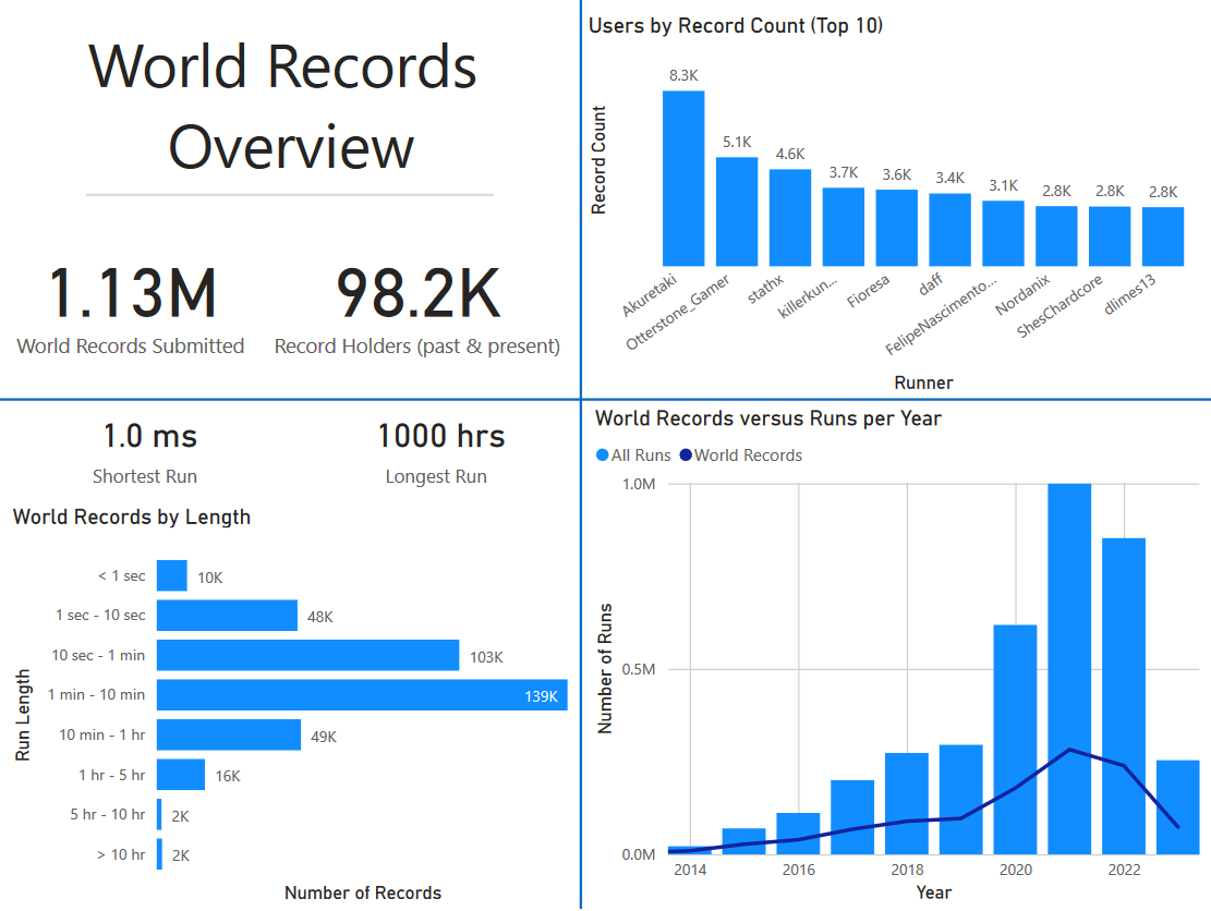
The upper-left quadrant gives the total number of world record submissions, and the total number of users who have held at least one world record. This latter value is derived from the calculated column record_count on the users data table, which utilizes the relationship between users and the world_records table:
users[record_count] = COUNTROWS(
    CALCULATETABLE(
        world_records,
        CALCULATETABLE(
            run_user,
            USERELATIONSHIP(world_records[id], run_user[run_id])
        )
    )
)
The USERELATIONSHIP function is necessary since the relationship between users and world_records (via the run_user bridge table) is inactive in the data model.
The plots in the remaining three quadrants all show different statistics for the world record speedruns. In the upper-right quadrant, we can see that some speedrunners have set thousands of world records, with the most prolific runner having submitted close to 10,000 records. In the bottom-left quadrant, a histogram of speedrun lengths for the current world records is given, showing that most world-record speedruns last from 1 - 10 minutes. The bottom-right histogram looks at how the number of world record submissions has changed over time, compared to the number of total speedruns.
Example Record Progression
The sixth page of the report focuses on a single game, and shows how the world record progressed over time:
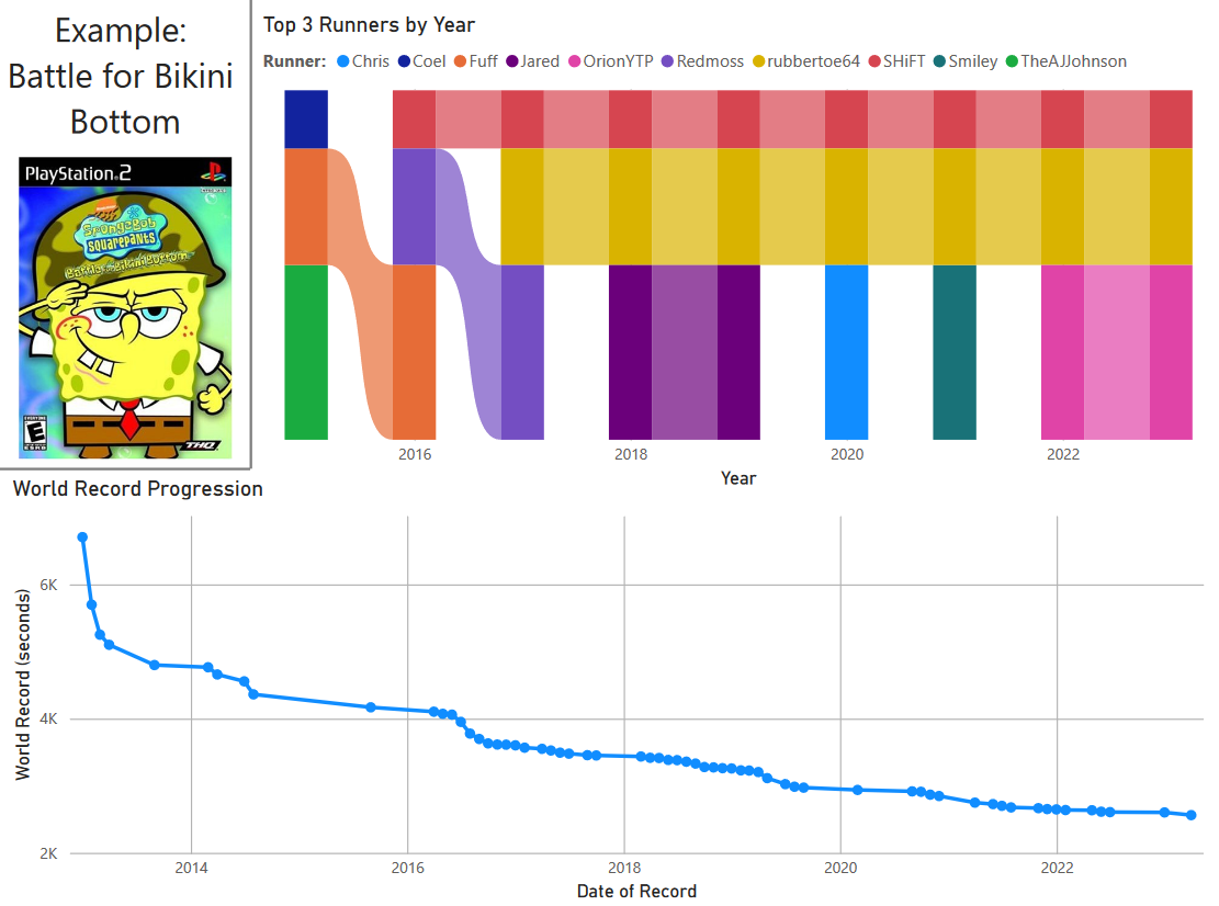
The example game used here is SpongeBob SquarePants: Battle for Bikini Bottom, which has a fairly robust speedrunning scene. The ribbon chart in the upper-left shows the first, second, and third-place speedrunners on the leaderboard from 2015 to 2023. This plot is based on a calculated table sponge_bob that computes the fastest times for each speedrunner:
sponge_bob = SUMMARIZE(
    spongebob,
    spongebob[Year],
    spongebob[username],
    "best_run",
    MIN(spongebob[run_time])
)
The SUMMARIZE function operates on an existing table and performs an aggregation operation (MIN) using the provided grouping columns (Year and username). With this information calculated, it is easy to pick out the top three speedrunners for each year and plot them in the ribbon chart.
The bottom line chart shows the game’s world record progression over time, with each scatter point denoting a new world record. We can see that progress was greater in the earlier stages, but then slowed down as the speedrun becomes more optimized and competitive.
Progression Statistics
The seventh and final page of the report describes general patterns for how world records tend to progress:
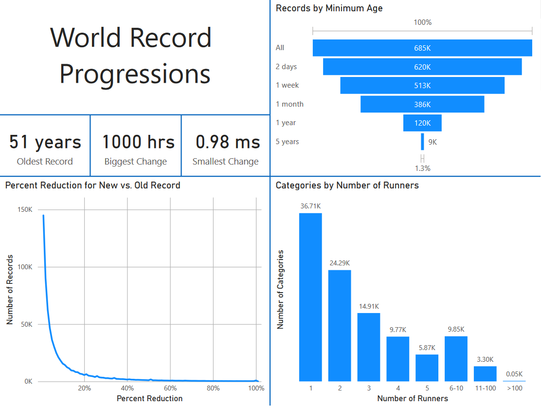
The bottom-left plot shows the percentage improvement that is observed when a new world record replaces the older record. This plot is computed using the improvements table, which gives the difference between sequential records:
improvements[prc_gap] = 100 * improvements[time_gap] / RELATED(runs[run_time])
improvements[gap_bin] = (FLOOR(improvements[prc_gap], 1) + 1) / 100
The prc_gap calculated column computes the ratio of the time gap over the total run duration, which is accessed from the runs table using RELATED. The gap_bin column groups together those improvement ratios into clear percentages, which are then aggregated and plotted.
The funnel plot at the top-right of the page shows how old the current set of world records are, with a record counting for a particular bin if it is at least as old as the label. As can be easily seen, most speedrunning world records are less than a year old.
In the bottom-right of the page, there is a histogram that shows the distribution of speedrunners across categories. Although this data does not explicitly involve world records, it shows that most categories have only one or two speedrunners that ever submitted records. This implies that a large number of world records are uncompetitive, and that the speedrunning community as a whole is spread thin across many different games.